")


Some homes unfold slowly. You discover them layer by layer, almost like a favorite novel you savor before bed. And then there are homes that greet you at the door wearing a marvelous coat, lipstick perfectly applied, asking if you’d like a glass of wine before you’ve even set down your bag.
This Lincoln Park project is very much the latter.
Meet the Client
Beth is a highly successful financial advisor, mom to one tween and two teenagers, and someone who somehow manages to fit tennis, mahjong, theater nights, travel, restaurants, and wine tastings into an already very full life. We actually met at a women’s networking event completely by chance. Two years later, she is someone I am lucky to call a friend.
She is cultured, decisive, and wonderfully trusting. When we get into the details, she often says, “You pick what you think is best.” That level of trust is refreshing and, honestly, it shows in the results. She once compared working with a designer to going to a high-end chef’s restaurant. You don’t send the plate back and ask for a dozen substitutions. You trust the process. That’s the only way to experience *chef’s kiss*.
Project Goals & Inspiration
The goal was clear from the start. Beth wanted her very own Marvelous Mrs. Maisel house. That meant embracing grandma chic with just enough edge to keep it fresh. Traditional architectural bones layered with personality. A subtle European, almost Parisian influence woven throughout. And beneath all of that beauty, durability that could stand up to three kids and a dog who very much believes the sofa belongs to him.
Each room needed to feel special and distinct, yet still part of a cohesive story. Nothing overly matched. Nothing random. Just thoughtful layers that feel collected over time. This is a throughway home. Kids cut through the living room to get to bedrooms. Friends gather in the family room. The dog claims his corner. It needed to look collected and cool while still holding up to real life.
The building itself is old and charming with some incredible character, but old buildings come with their own realities. Concrete ceilings and walls made plumbing changes in the bathroom more complex. Electrical updates had limits. It required some really creative problem solving layered under all the pretty.
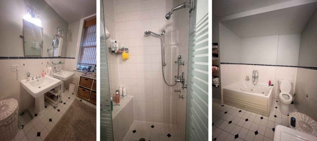
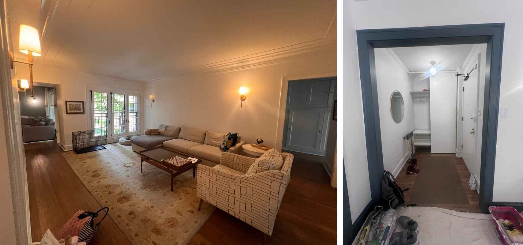
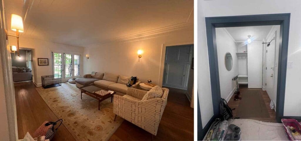
Before we touched it, the home had great bones but felt disconnected. The primary bathroom had a tiny 3 by 3 shower tucked in the corner. The living spaces lacked color and personality. Some pieces were sentimental but needed refinement. The structure was there, but the soul just needed a little coaxing.
Are you ready to step inside?
Bold & Confident Entry
The entry is where this story really begins. It’s the first impression and we wanted it to feel personal to Beth.
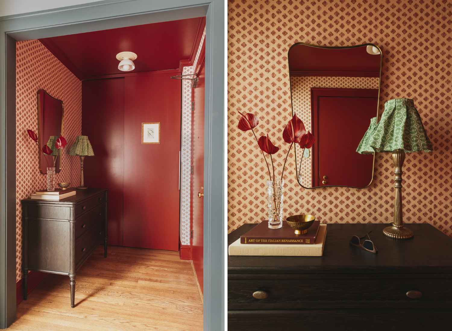
As you can tell, we embraced the boldness. Deep red paint wraps the walls and ceiling, creating an enveloping, almost jewel box effect the moment you step inside. Paired with patterned wallpaper that leans delightfully nostalgic, it immediately sets the tone for what’s ahead.
The curvature of the mirror adds softness against all that saturation, bringing in shape and light so the space feels intentional rather than overwhelming. And that petite lamp with its pleated green shade? Perfection. It feels collected, almost Parisian, like something you might stumble upon in a tucked away antique shop. It’s not a large entry… but it really doesn’t need to be. It’s giving grandma chic in the very best way.
Balanced & Welcoming Living Room
When you step beyond the entry, you reach the living room. It acts as a connector, guiding you toward the rest of the home, so it needed to introduce personality in a gentler way.
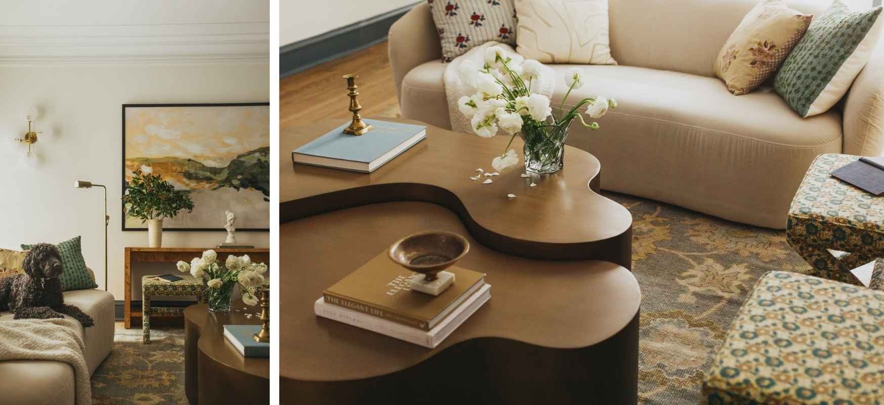
We intentionally softened the palette in this space and kept the furnishings mostly neutral. The creamy wall color creates a quiet backdrop that allows everything layered on top to feel intentional and collected.
At the center of the space is a sculptural, curved coffee table that echoes the gentle curvature of the sofa. That subtle repetition of organic shapes creates flow and keeps the room feeling relaxed and inviting.
And while the foundation is neutral, the room is anything but flat. Pattern and life come in through the throw pillows, upholstered stools, the rug, and of course the art. Subtle color and traditional motifs quietly reinforce the story we’re telling throughout the rest of the home.
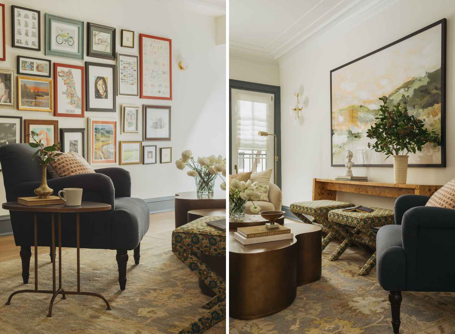
Layered art is what truly makes this space feel personal. One wall holds a gallery arrangement that includes drawings of every home she has lived in throughout her life. Fun story: when we were installing, I realized she did not yet have a drawing of this Lincoln Park residence. So for the holidays, I commissioned one to complete the series. She loved it. Those small details, the ones you catch between the lines, are often the most meaningful.
Across the room, an oversized landscape anchors the space above a warm burl wood console, giving the room presence and depth.
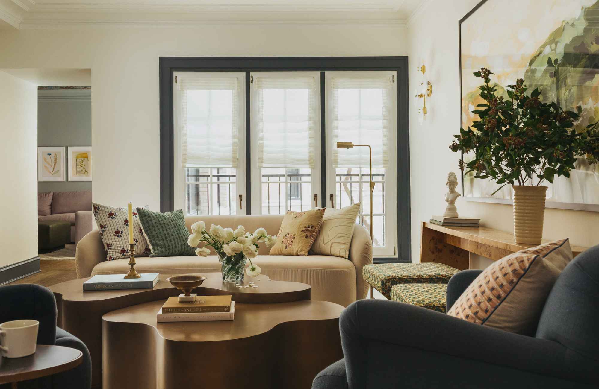
This room has become a little lounge for the family. A place to have coffee in the morning, read in the afternoon light, or sit and talk with friends before dinner. It is quieter than the family room, softer in energy, and exactly the kind of space that makes a home feel lived in.
Lively & Layered Family Room
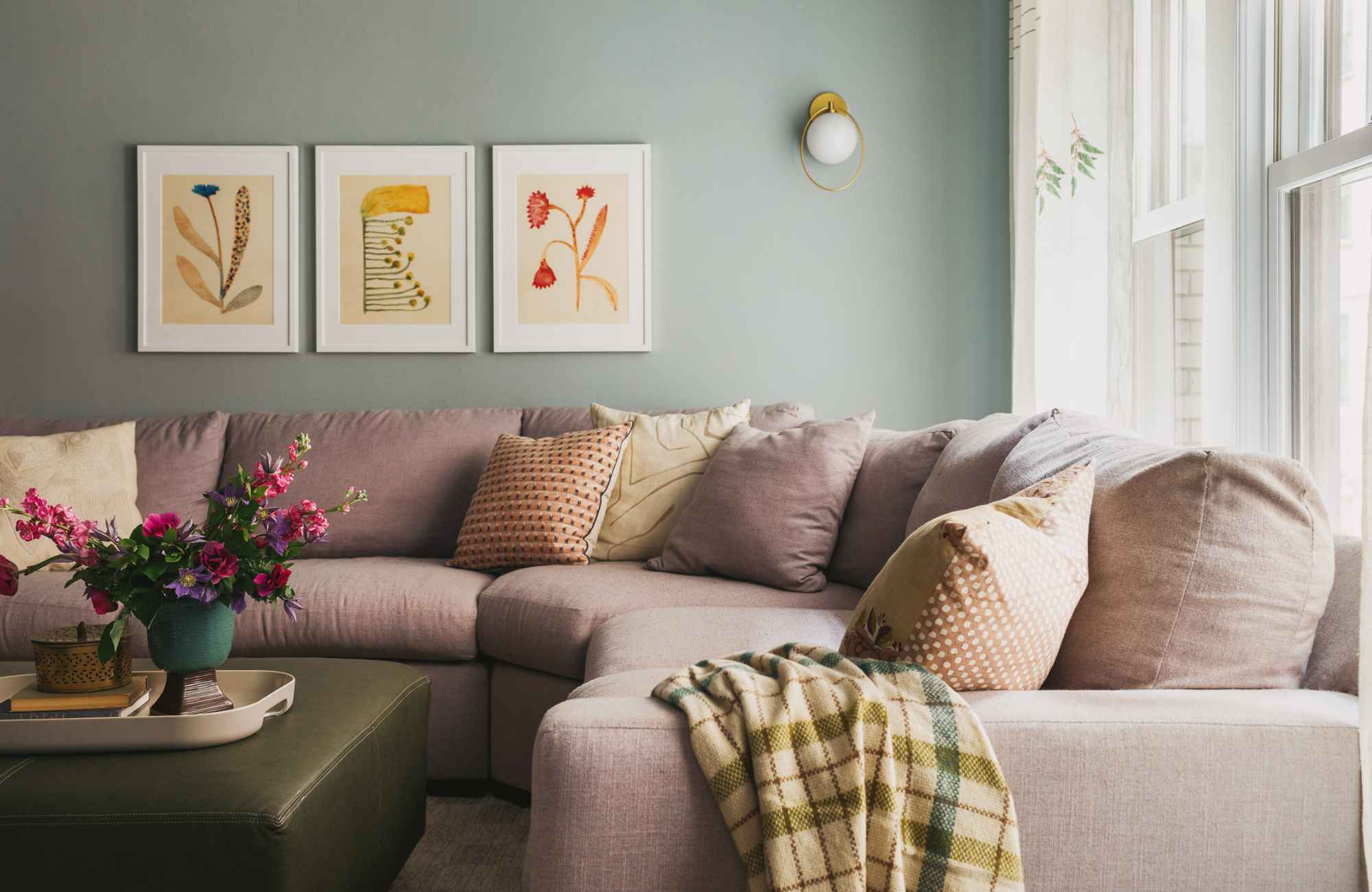
This room has such an energy to it, doesn’t it? I can’t help but smile every single time I walk in here!
Our first bold move was the lilac sofa. It feels playful and feminine, but when paired with deeper earth tones and rich wood finishes, it grounds the space beautifully. There is a softness to the color, especially in the afternoon light, that makes the whole space feel cozy.
But the standout feature in this space? Definitely the ceiling…
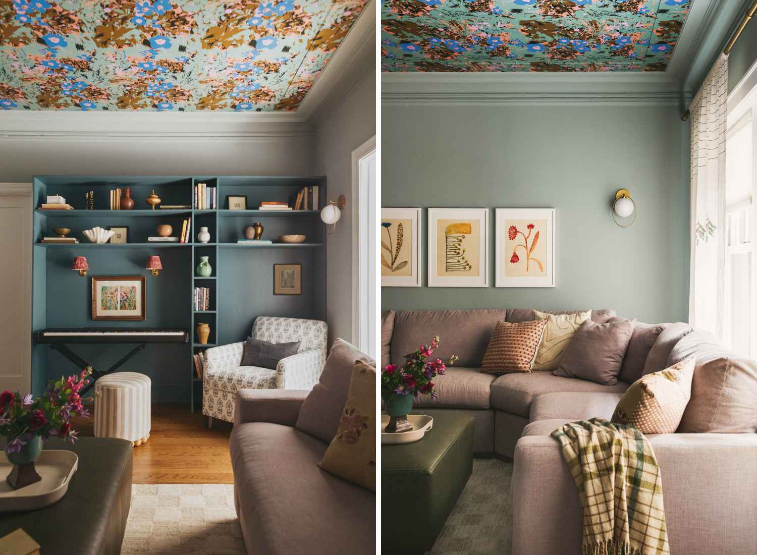
Instead of leaving it quiet, we made it part of the story. Your eye naturally travels upward to the vibrant floral wallpaper. It feels vintage and daring at the same time. An unexpected move, yes, but the room was absolutely begging for it.
Between the ceiling and the teal built-in shelving, the color brings depth and interest to the room. Tucked into the corner is a cozy chair where her son sits with his guitar while his sister plays the piano. And can we talk about those sconces with the eye-catching red shades?! The sweetest finishing touch to this nook.
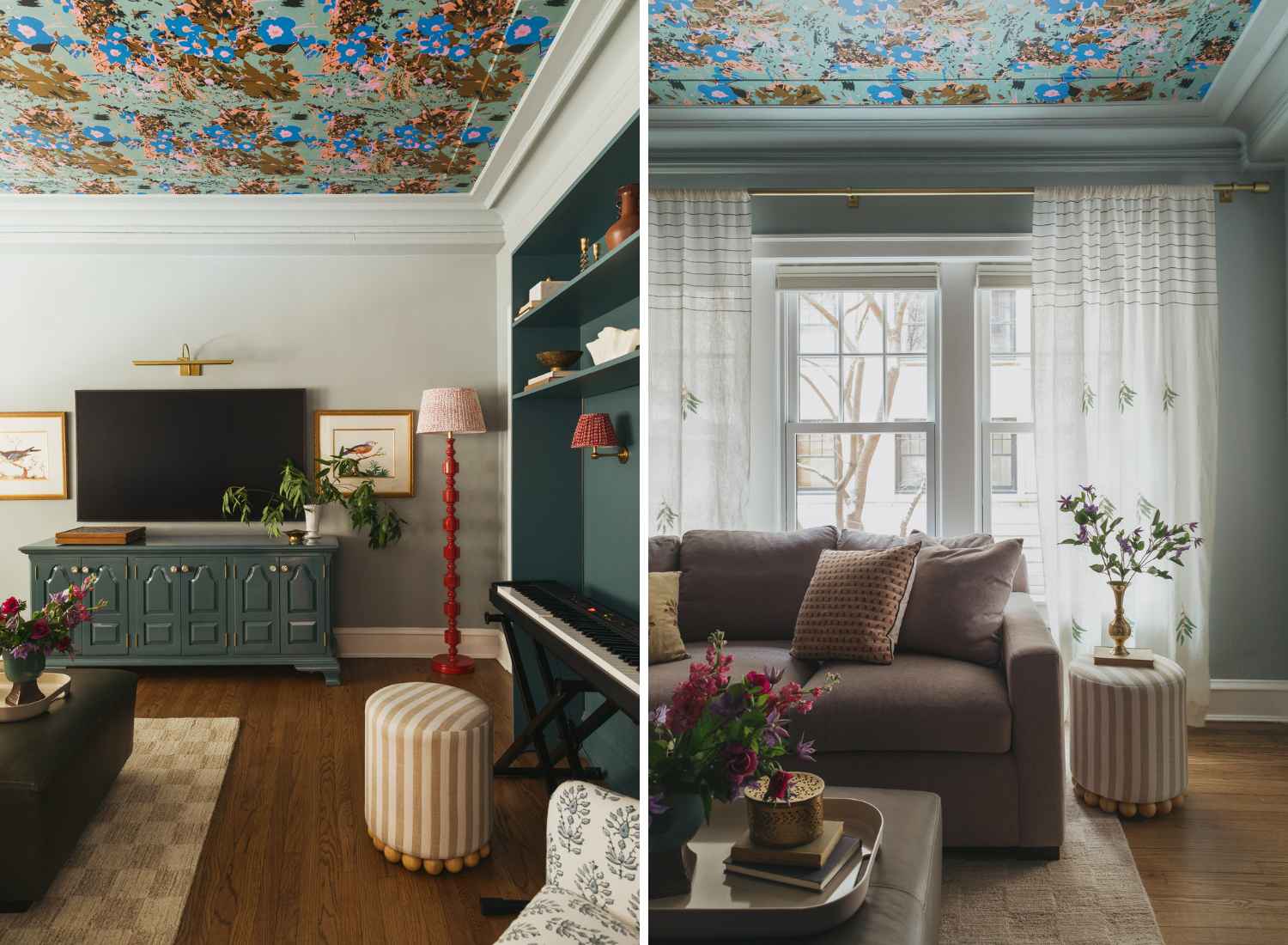
The media console was a piece from her mom, so instead of replacing it, we refinished it in a high gloss lacquer that mirrors the built-in shelving. It now feels elevated and intentional while still honoring family history. Those are my favorite transformations. When something meaningful gets to stay, just in a new light.
This room holds music, conversation, kids drifting in and out, and quiet moments with a book. It’s bold without being overwhelming and playful without losing sophistication.
Primary Bathroom with Presence
This was our only major renovation, and it completely transformed Beth’s daily routine. If you remember the before photos, the space felt tight and underutilized. Now, it feels calm, intentional, and thoughtfully designed from top to bottom.
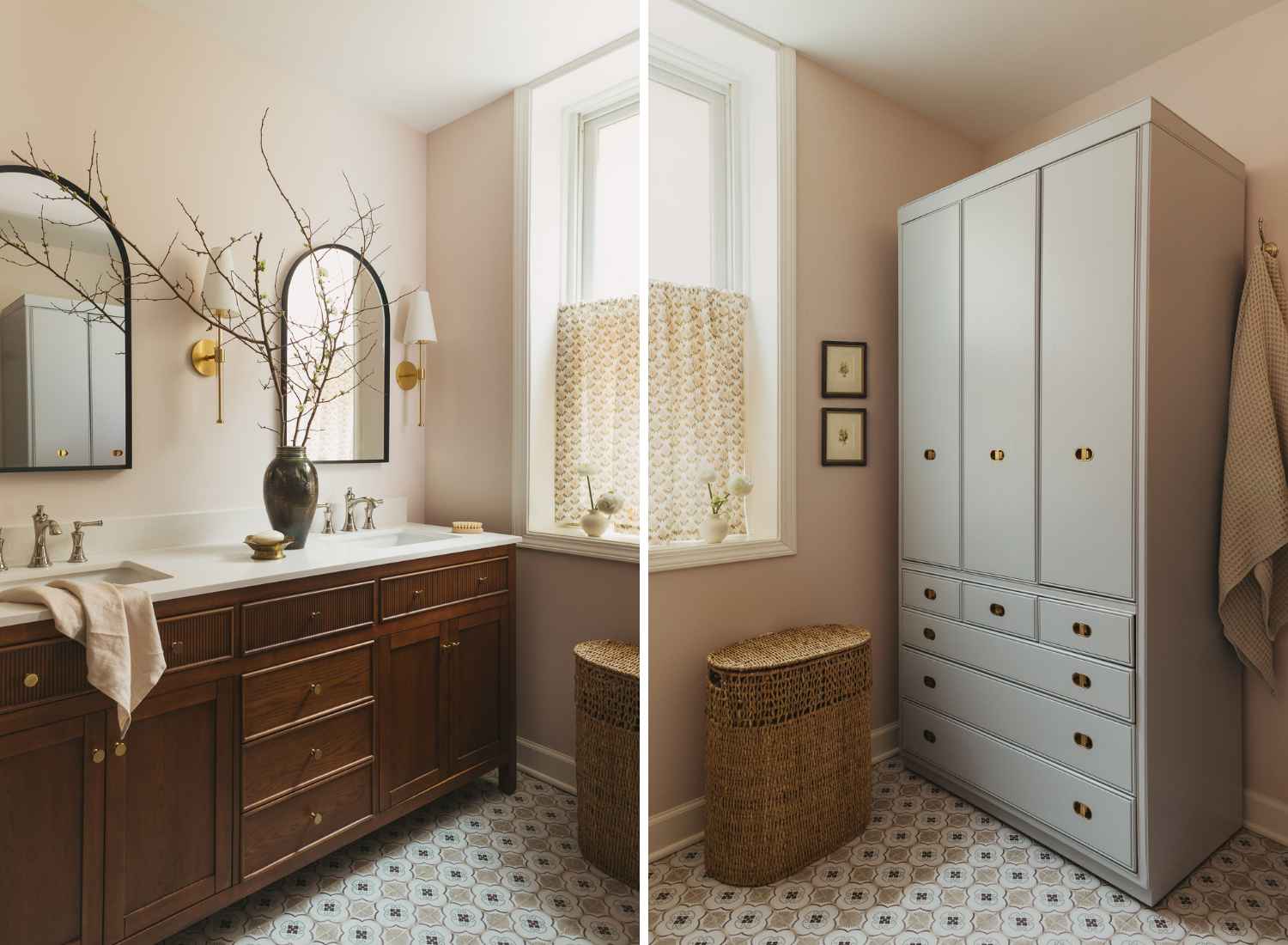
The double vanity is finished in a rich walnut with brass hardware that feels warm and timeless. Generous drawers keep everything organized and tucked away, which makes this modest footprint work so much harder. In a bathroom like this, every inch matters. To support that, we added a tall cabinet to take advantage of vertical space, providing hidden storage for towels and everyday essentials without crowding the room.
And then there is the shower…
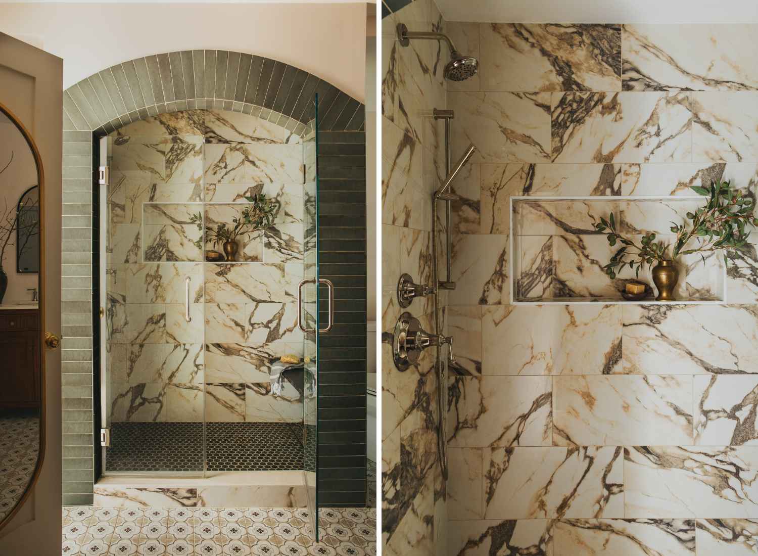
We removed the tub entirely and relocated the shower into that footprint, transforming what was once a cramped 3 by 3 stall into something that finally feels generous. The arched entry, framed in earthy green tile, gives it architectural presence and subtly nods to the age of the building.
Inside, large scale marble tile wraps the walls in dramatic veining that almost reads like artwork. A dark hex tile grounds the floor, adding depth and contrast. The niche detail blends function and beauty, which is always the goal.
Now Beth’s bathroom feels like a boutique hotel tucked inside a historic Chicago home. Refined, layered, and most importantly, supportive of her everyday life.
An Authentic Home Reflecting Personal Style
This has been one of those rare projects where trust and friendship intertwine with creative freedom. The kind of collaboration that reminds me why I love what I do.
What makes a home like this possible is a willingness to move thoughtfully, to make decisions with intention rather than urgency, and to allow layers to build over time. When a client leans into that process, the result feels personal rather than just finished. This home feels like Beth. And that is always the end goal.
If you are dreaming of a home that feels entirely your own, I would love to help you bring it to life.
Warmly,
Kristen
ABOUT THE AUTHOR
Kristen Pipal is the founder and principal designer of KP Home. She creates timeless, personality-driven spaces throughout Chicago and beyond. Kristen is especially passionate about helping busy families and professionals enjoy homes that support their lifestyle.

")
